Markets
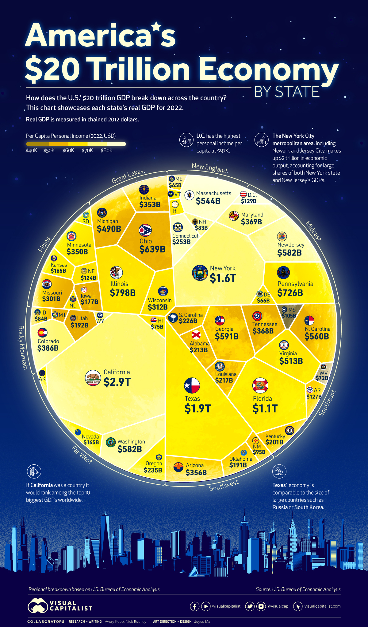
Visualized: The U.S. $20 Trillion Economy by State
 Can I share this graphic?
 When do I need a license?
 Interested in this piece?
Visualized: The U.S. $20 Trillion Economy by State
A sum of its parts, every U.S. state plays an integral role in the country’s overall economy.
Texas, for example, generates an economic output that is comparable to South Korea’s, and even a small geographical area like Washington, D.C. outputs over $129 billion per year.
The visualization above uses 2022 annual data out of the U.S. Bureau of Economic Analysis (BEA) to showcase each state or district’s real gross domestic product (GDP) in chained 2012 dollars, while also highlighting personal income per capita.
A Closer Look at the States
California is by far the biggest state economy in the U.S. at $2.9 trillion in real GDP—and when comparing its nominal value ($3.6 trillion) with national GDPs worldwide, the Golden State’s GDP would rank 5th overall, just below Germany and Japan.
Here’s an up-close look at the data:
| Rank | State | Real GDP (chained 2012 dollars) |
|---|---|---|
| 1 | California | $2.9 trillion |
| 2 | Texas | $1.9 trillion |
| 3 | New York | $1.6 trillion |
| 4 | Florida | $1.1 trillion |
| 5 | Illinois | $798 billion |
| 6 | Pennsylvania | $726 billion |
| 7 | Ohio | $639 billion |
| 8 | Georgia | $591 billion |
| 9 | Washington | $582 billion |
| T9 | New Jersey | $582 billion |
| 11 | North Carolina | $560 billion |
| 12 | Massachusetts | $544 billion |
| 13 | Virginia | $513 billion |
| 14 | Michigan | $490 billion |
| 15 | Colorado | $386 billion |
| 16 | Maryland | $369 billion |
| 17 | Tennessee | $368 billion |
| 18 | Arizona | $356 billion |
| 19 | Indiana | $353 billion |
| 20 | Minnesota | $350 billion |
| 21 | Wisconsin | $312 billion |
| 22 | Missouri | $301 billion |
| 23 | Connecticut | $253 billion |
| 24 | Oregon | $235 billion |
| 25 | South Carolina | $226 billion |
| 26 | Louisiana | $217 billion |
| 27 | Alabama | $213 billion |
| 28 | Kentucky | $201 billion |
| 29 | Utah | $192 billion |
| 30 | Oklahoma | $191 billion |
| 31 | Iowa | $177 billion |
| 32 | Nevada | $165 billion |
| T32 | Kansas | $165 billion |
| 34 | District of Columbia | $129 billion |
| 35 | Arkansas | $127 billion |
| 36 | Nebraska | $124 billion |
| 37 | Mississippi | $105 billion |
| 38 | New Mexico | $95 billion |
| 39 | Idaho | $84 billion |
| 40 | New Hampshire | $83 billion |
| 41 | Hawaii | $75 billion |
| 42 | West Virginia | $72 billion |
| 43 | Delaware | $66 billion |
| 44 | Maine | $65 billion |
| 45 | Rhode Island | $55 billion |
| 46 | North Dakota | $53 billion |
| 47 | South Dakota | $50 billion |
| T47 | Montana | $50 billion |
| T47 | Alaska | $50 billion |
| 50 | Wyoming | $36 billion |
| 51 | Vermont | $31 billion |
| United States | $20 trillion |
Altogether, California, New York, and Texas account for almost one-third of the country’s economy, combining for $6.3 trillion in real GDP in 2022. The only other state that reached the trillion dollar mark is Florida with $1.1 trillion.
Texas’ economy is driven largely by industries like advanced manufacturing, biotech, life sciences, aerospace, and defense. The state is also home to a number of large companies, like Tesla and Texas Instruments, which make it a hub for jobs, innovation, and opportunity.
New York state is a leader in the insurance, agribusiness, clean energy, and cyber security industries, among many others. Zooming into the New York City area reveals huge sources of economic output from the tourism, media, and financial services sectors.
Regional Disparities
While the aforementioned states are the big hitters, the median GDP per state was much lower at $217 billion in 2022.
Under the BEA’s eight region breakdown, all states in the Great Lakes region had GDPs that were higher than the median, reflecting the industrial strength of states like Illinois and Ohio. Most of the states in the Mideast region including New York, Pennsylvania, and Maryland also have GDPs higher than the country median.
Comparatively, many states in the Plains region had lower GDPs, including Iowa and Kansas. Other states with lower GDPs (and generally lower populations) were spread around the country, including lowest-ranked Vermont in New England.
Personal Income per Capita
In addition to real GDP, this voronoi diagram has been color-coded in terms of personal income per capita in each state. Here’s a closer look at those figures:
| Rank | State | Personal Income per Capita |
|---|---|---|
| 1 | District of Columbia | $96,728 |
| 2 | Connecticut | $84,972 |
| 3 | Massachusetts | $84,945 |
| 4 | New Jersey | $78,700 |
| 5 | New York | $78,089 |
| 6 | California | $77,339 |
| 7 | Washington | $75,698 |
| 8 | New Hampshire | $74,663 |
| 9 | Colorado | $74,167 |
| 10 | Wyoming | $71,342 |
| 11 | Maryland | $70,730 |
| 12 | Alaska | $68,919 |
| 13 | Illinois | $68,822 |
| 14 | Virginia | $68,211 |
| 15 | Minnesota | $68,010 |
| 16 | North Dakota | $66,184 |
| 17 | South Dakota | $65,806 |
| 18 | Rhode Island | $65,377 |
| 19 | Pennsylvania | $65,167 |
| 20 | Florida | $63,597 |
| 21 | Nebraska | $63,321 |
| 22 | Vermont | $63,206 |
| 23 | Oregon | $62,767 |
| 24 | Texas | $61,985 |
| 25 | Delaware | $61,387 |
| 26 | Nevada | $61,282 |
| 27 | Wisconsin | $61,210 |
| 28 | Hawaii | $61,175 |
| 29 | Kansas | $60,152 |
| 30 | Maine | $59,463 |
| 31 | Iowa | $58,905 |
| 32 | Tennessee | $58,279 |
| 33 | Indiana | $57,930 |
| 34 | Utah | $57,925 |
| 35 | Ohio | $57,880 |
| 36 | Montana | $57,719 |
| 37 | North Carolina | $57,416 |
| 38 | Georgia | $57,129 |
| 39 | Michigan | $56,813 |
| 40 | Arizona | $56,667 |
| 41 | Missouri | $56,551 |
| 42 | Oklahoma | $54,998 |
| 43 | Louisiana | $54,622 |
| 44 | Idaho | $54,537 |
| 45 | South Carolina | $53,320 |
| 46 | Kentucky | $52,109 |
| 47 | Arkansas | $51,787 |
| 48 | New Mexico | $51,500 |
| 49 | Alabama | $50,637 |
| 50 | West Virginia | $49,169 |
| 51 | Mississippi | $46,248 |
Economic Engines and Future Growth
Many of the largest state economies are fueled by strong urban populations. These metropolitan cities are the economic engines of the country, driving innovation and attracting new talent.
The NYC-Newark-Jersey City metropolitan area is a great example of this, generating over $2 trillion in economic output alone. Los Angeles generated $1.1 trillion.
While these are the obvious and expected hubs, some new cities and states are beginning to attract new business and are anticipating significant economic growth. North Carolina, for example, has been ranked as the best U.S. state to do business in, thanks to a number of factors like ease of access to capital and a strong culture of tech and innovation.
Over time, the centers of economic power may be slowly shifting in the U.S., but for now the top contributors to the nation’s GDP far outpace the rest.


Markets
What History Reveals About Interest Rate Cuts
How have previous cycles of interest rate cuts in the U.S. impacted the economy and financial markets?
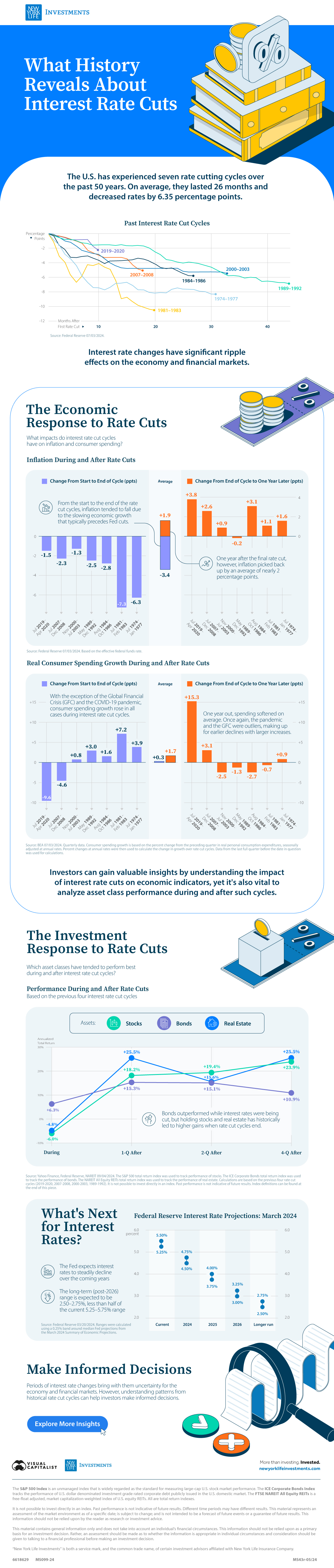
What History Reveals About Interest Rate Cuts
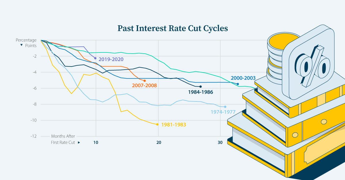
The Federal Reserve has overseen seven cycles of interest rate cuts, averaging 26 months and 6.35 percentage points (ppts) each.
We’ve partnered with New York Life Investments to examine the impact of interest rate cut cycles on the economy and on the performance of financial assets in the U.S. to help keep investors informed.
A Brief History of Interest Rate Cuts
Interest rates are a powerful tool that the central bank can use to spur economic activity.
Typically, when the economy experiences a slowdown or a recession, the Federal Reserve will respond by cutting interest rates. As a result, each of the previous seven rate cut cycles—shown in the table below—occurred during or around U.S. recessions, according to data from the Federal Reserve.
| Interest Rate Cut Cycle | Magnitude (ppts) |
|---|---|
| July 2019–April 2020 | -2.4 |
| July 2007–December 2008 | -5.1 |
| November 2000–July 2003 | -5.5 |
| May 1989–December 1992 | -6.9 |
| August 1984–October 1986 | -5.8 |
| July 1981–February 1983 | -10.5 |
| July 1974–January 1977 | -8.3 |
| Average | -6.4 |
Source: Federal Reserve 07/03/2024
Understanding past economic and financial impacts of interest rate cuts can help investors prepare for future monetary policy changes.
The Economic Response: Inflation
During past cycles, data from the Federal Reserve, shows that, on average, the inflation rate continued to decline throughout (-3.4 percentage points), largely due to the lagged effects of a slower economy that normally precedes interest rate declines.
| Cycle | Start to end change (ppts) | End to one year later (ppts) |
|---|---|---|
| July 2019–April 2020 | -1.5 | +3.8 |
| July 2007–December 2008 | -2.3 | +2.6 |
| November 2000–July 2003 | -1.3 | +0.9 |
| May 1989–December 1992 | -2.5 | -0.2 |
| August 1984–October 1986 | -2.8 | +3.1 |
| July 1981–February 1983 | -7.3 | +1.1 |
| July 1974–January 1977 | -6.3 | +1.6 |
| Average | -3.4 | +1.9 |
Source: Federal Reserve 07/03/2024. Based on the effective federal funds rate. Calculations are based on the previous four rate cut cycles (2019-2020, 2007-2008, 2000-2003, 1989-1992, 1984-1986, 1981-1983, 1974-1977).
However, inflation played catch-up and rose by +1.9 percentage points one year after the final rate cut. With lower interest rates, consumers were incentivized to spend more and save less, which led to an uptick in the price of goods and services in six of the past seven cycles.
The Economic Response: Real Consumer Spending Growth
Real consumer spending growth, as measured by the Bureau of Economic Analysis, typically reacted to rate cuts more quickly.
On average, consumption growth rose slightly during the rate cut periods (+0.3 percentage points) and that increase accelerated one year later (+1.7 percentage points).
| Cycle | Start to end (ppts) | End to one year later (ppts) |
|---|---|---|
| July 2019–April 2020 | -9.6 | +15.3 |
| July 2007–December 2008 | -4.6 | +3.1 |
| November 2000–July 2003 | +0.8 | -2.5 |
| May 1989–December 1992 | +3.0 | -1.3 |
| August 1984–October 1986 | +1.6 | -2.7 |
| July 1981–February 1983 | +7.2 | -0.7 |
| July 1974–January 1977 | +3.9 | +0.9 |
| Average | +0.3 | +1.7 |
Source: BEA 07/03/2024. Quarterly data. Consumer spending growth is based on the percent change from the preceding quarter in real personal consumption expenditures, seasonally adjusted at annual rates. Percent changes at annual rates were then used to calculate the change in growth over rate cut cycles. Data from the last full quarter before the date in question was used for calculations. Calculations are based on the previous four rate cut cycles (2019-2020, 2007-2008, 2000-2003, 1989-1992, 1984-1986, 1981-1983, 1974-1977).
The COVID-19 pandemic and the Global Financial Crisis were outliers. Spending continued to fall during the rate cut cycles but picked up one year later.
The Investment Response: Stocks, Bonds, and Real Estate
Historically, the trend in financial asset performance differed between stocks, bonds, and real estate both during and after interest rate declines.
Stocks and real estate posted negative returns during the cutting phases, with stocks taking the bigger hit. Conversely, bonds, a traditional safe haven, gained ground.
| Asset | During (%) | 1 Quarter After (%) | 2 Quarters After (%) | 4 Quarters After (%) |
|---|---|---|---|---|
| Stocks | -6.0 | +18.2 | +19.4 | +23.9 |
| Bonds | +6.3 | +15.3 | +15.1 | +10.9 |
| Real Estate | -4.8 | +25.5 | +15.6 | +25.5 |
Source: Yahoo Finance, Federal Reserve, NAREIT 09/04/2024. The S&P 500 total return index was used to track performance of stocks. The ICE Corporate Bonds total return index was used to track the performance of bonds. The NAREIT All Equity REITs total return index was used to track the performance of real estate. Calculations are based on the previous four rate cut cycles (2019-2020, 2007-2008, 2000-2003, 1989-1992). It is not possible to invest directly in an index. Past performance is not indicative of future results. Index definitions can be found at the end of this piece.
However, in the quarters preceding the last rate cut, all three assets increased in value. One year later, real estate had the highest average performance, followed closely by stocks, with bonds coming in third.
What’s Next for Interest Rates
In March 2024, the Federal Reserve released its Summary of Economic Projections outlining its expectation that U.S. interest rates will fall steadily in 2024 and beyond.
| Year | Range (%) | Median (%) |
|---|---|---|
| Current | 5.25-5.50 | 5.375 |
| 2024 | 4.50-4.75 | 4.625 |
| 2025 | 3.75-4.0 | 3.875 |
| 2026 | 3.00-3.25 | 3.125 |
| Longer run | 2.50-2.75 | 2.625 |
Source: Federal Reserve 20/03/2024
Though the timing of interest rate cuts is uncertain, being armed with the knowledge of their impact on the economy and financial markets can provide valuable insight to investors.
Explore more insights from New York Life Investments.

-

 Markets3 days ago
Which Retailers Operate in the Most Countries?
From fast-fashion giant H&M to Apple, we show the top retailers globally with the largest international presence.
-
 Maps1 week ago
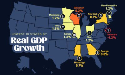
Mapped: The 10 U.S. States With the Lowest Real GDP Growth
In this graphic, we show where real GDP lagged the most across America in 2023 as high interest rates weighed on state economies.
-

 Venture Capital1 week ago
Ranked: The World’s 50 Largest Private Equity Firms
In this graphic, we show the largest private equity firms in the world—from titan Blackstone to China’s leading alternative funds.
-

 Debt1 week ago
Top 10 Countries Most in Debt to the IMF
Argentina tops the ranking, with a debt equivalent to 5.3% of the country’s GDP.
-
 Markets1 week ago
Ranked: The Top 6 Economies by Share of Global GDP (1980-2024)
Gain a unique perspective on the world’s economic order from this graphic showing % share of global GDP over time.
-
 Economy2 weeks ago
Mapped: Europe’s GDP Per Capita, by Country
Which European economies are richest on a GDP per capita basis? This map shows the results for 44 countries across the continent.

-
Debt1 week ago
Top 10 Countries Most in Debt to the IMF
-
 Automotive2 weeks ago
How People Get Around in America, Europe, and Asia
-

 Maps2 weeks ago
Mapped: Southeast Asia’s GDP Per Capita, by Country
-
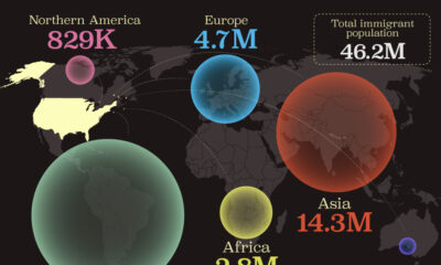
 Demographics2 weeks ago
Mapped: U.S. Immigrants by Region
-
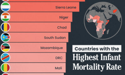
 Healthcare2 weeks ago
Which Countries Have the Highest Infant Mortality Rates?
-

 Politics2 weeks ago
Charted: How Americans Feel About Federal Government Agencies
-

 Mining2 weeks ago
Visualizing Copper Production by Country in 2023
-

 Culture2 weeks ago
How Popular Snack Brand Logos Have Changed