Debt
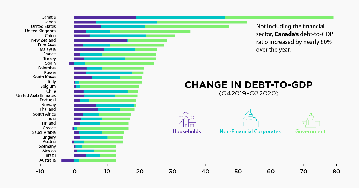
Chart: Debt-to-GDP Continues to Rise Around the World

Chart: Debt-to-GDP Continues to Rise Around the World
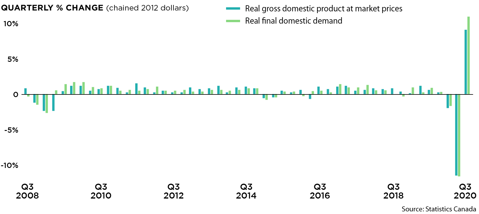
With vaccines slowly obtaining approval in various countries, the world may finally be on the path to overcoming the COVID-19 pandemic.
The economic situation, on the other hand, is unlikely to improve anytime soon. Falling revenues combined with costly pandemic relief measures have increased global debt by $20 trillion since the third quarter of 2019. By the end of 2020, economists expect global debt to reach $277 trillion, or 365% of world GDP.
Today’s chart uses data from the Institute of International Finance (IIF) to provide an overview of where debt, relative to GDP, has increased the most.
Comparing Developed and Emerging Markets
Developed economies represent four of the five countries seeing the largest increases in debt-to-GDP, but looking from a more macro angle reveals that debt levels are rising at a similar pace around the world.
| Q3 2019 ($ trillions) | Q3 2020 ($ trillions) | % Increase | |
|---|---|---|---|
| Developed markets | $181.8 | $196.3 | 8.0% |
| Emerging markets | $70.9 | $76.4 | 7.7% |
| Global total | $252.7 | $272.7 | 7.9% |
Source: IIF, BIS, IMF, Haver, National Sources
To put these figures into perspective, economists often use the debt-to-GDP metric, which compares a country’s debt to its economic output. As the name implies, it’s calculated by taking a country’s total debts and dividing them by its annual GDP. Having a low debt-to-GDP ratio suggests that a country will have little issues paying off its debts, while a high ratio can be interpreted as a sign of higher default risk.
The actual definition of a “low” or “high” ratio is quite loose, though the World Bank believes there is a threshold for government debt at 77% of GDP. Every percentage point beyond this threshold has been found to detract 0.017 percentage points from annual growth.
Comparing Debt-to-GDP by Sector
To see how COVID-19 has affected the global economy since Q3 2019, let’s take a look at each sector’s debt as a percentage of GDP.
| Households (Q3 '19) | Households (Q3 '20) | Non-financials* (Q3 '19) | Non-financials* (Q3 '20) | Government (Q3 '19) | Government (Q3 '20) | |
|---|---|---|---|---|---|---|
| Developed markets average | 72% | 78% | 91% | 102% | 110% | 131% |
| U.S. | 74% | 81% | 75% | 88% | 102% | 127% |
| Euro Area | 58% | 61% | 108% | 114% | 102% | 115% |
| UK | 84% | 88% | 73% | 78% | 110% | 130% |
| Emerging markets average | 40% | 44% | 93% | 104% | 53% | 60% |
| China | 54% | 60% | 150% | 166% | 53% | 63% |
| Russia | 19% | 23% | 78% | 91% | 15% | 18% |
| Global total | 60% | 65% | 92% | 103% | 89% | 105% |
*Corporations that are not in the financial industry.
Source: IIF, BIS, Haver, National Sources
Within developed markets, government debt-to-GDP grew by 21 percentage points compared to 11 for non-financial corporates, and 6 for households. This is unsurprising as governments have supplied billions (or in some cases, trillions) of economic stimulus while also pulling in less tax revenue.
The story in emerging markets is slightly different, with non-financial corporates experiencing the largest increase at 11 percentage points. The sector’s debt is now at 104% of GDP, making it the most highly-leveraged in the region.
Highlights from Today’s Chart
Today’s chart boils this data down to the individual country level, allowing us to identify two outliers: Canada and Australia.
Excluding the financial sector, Canada’s debt-to-GDP ratio increased by nearly 80%, the highest of any developed country. Government borrowing surged as the Canada Emergency Response Benefit (CERB), which provided struggling Canadians with roughly $1,500 a month, rang up a bill of $60 billion over 7 months.
An increase in debt wasn’t the only reason for the country’s worsening debt-to-GDP ratios. In Q2 2020, Canada’s GDP declined at an annualized rate of 38%, its worst three-month performance on record.
Australia was another outlier, but for a different reason; the country’s household debt decreased by almost 5% relative to GDP. This was likely due to an early-access scheme that allowed millions of Australians to make withdrawals from their superannuation, a social security fund similar to America’s 401(k).
We know that almost 60 per cent of those accessing their [superannuation] early have used it…to meet essential day-to-day expenses, including paying down debts.
—Josh Frydenberg, Treasurer of the Commonwealth of Australia
Officials have exercised caution around the prolonged use of these programs, as superannuation funds are meant to support people through retirement. Of the 2.6 million Australians that accessed their superannuations early, 500,000 are believed to have completely emptied their accounts.
Debt-to-GDP is Set to Fall…Or is it?
A global roll out of COVID-19 vaccines is likely to end the ongoing health crisis and allow the economy to return to pre-pandemic levels, though delays are to be expected.
Regardless, this spells good news for governments and financial institutions around the world—economic output will recover, shrinking debt-to-GDP ratios. Whether or not borrowing will also slow down, however, is much harder to predict.
Government borrowing has been relied on to stimulate growth since 2008, and with 75% of Americans in favor of a second COVID-19 relief bill, public debt is likely to accumulate further. Private sector debt is following a similar trend, with non-financial U.S. corporations owing $10.9 trillion as of Q2 2020, up from $6.4 trillion at the start of 2008.
These growing debts have been manageable thanks to an extended period of low interest rates and loose monetary policy, but whether or not this is sustainable remains to be seen.


Debt
How Debt-to-GDP Ratios Have Changed Since 2000
See how much the debt-to-GDP ratios of advanced economies have grown (or shrank) since the year 2000.


How Debt-to-GDP Ratios Have Changed Since 2000
This was originally posted on our Voronoi app. Download the app for free on Apple or Android and discover incredible data-driven charts from a variety of trusted sources.
Government debt levels have grown in most parts of the world since the 2008 financial crisis, and even more so after the COVID-19 pandemic.
To gain perspective on this long-term trend, we’ve visualized the debt-to-GDP ratios of advanced economies, as of 2000 and 2024 (estimated). All figures were sourced from the IMF’s World Economic Outlook.
Data and Highlights
The data we used to create this graphic is listed in the table below. “Government gross debt” consists of all liabilities that require payment(s) of interest and/or principal in the future.
| Country | 2000 (%) | 2024 (%) | Change (pp) |
|---|---|---|---|
| 🇯🇵 Japan | 135.6 | 251.9 | +116.3 |
| 🇸🇬 Singapore | 82.3 | 168.3 | +86.0 |
| 🇺🇸 United States | 55.6 | 126.9 | +71.3 |
| 🇬🇧 United Kingdom | 36.6 | 105.9 | +69.3 |
| 🇬🇷 Greece | 104.9 | 160.2 | +55.3 |
| 🇫🇷 France | 58.9 | 110.5 | +51.6 |
| 🇵🇹 Portugal | 54.2 | 104.0 | +49.8 |
| 🇪🇸 Spain | 57.8 | 104.7 | +46.9 |
| 🇸🇮 Slovenia | 25.9 | 66.5 | +40.6 |
| 🇫🇮 Finland | 42.4 | 76.5 | +34.1 |
| 🇭🇷 Croatia | 35.4 | 61.8 | +26.4 |
| 🇨🇦 Canada | 80.4 | 103.3 | +22.9 |
| 🇨🇾 Cyprus | 56.0 | 70.9 | +14.9 |
| 🇦🇹 Austria | 65.7 | 74.0 | +8.3 |
| 🇸🇰 Slovak Republic | 50.5 | 56.5 | +6.0 |
| 🇩🇪 Germany | 59.3 | 64.0 | +4.7 |
| 🇧🇪 Belgium | 109.6 | 106.8 | -2.8 |
| 🇮🇱 Israel | 77.4 | 56.8 | -20.6 |
| 🇮🇸 Iceland | 75.8 | 54.6 | -21.2 |
The debt-to-GDP ratio indicates how much a country owes compared to the size of its economy, reflecting its ability to manage and repay debts. Percentage point (pp) changes shown above indicate the increase or decrease of these ratios.
Countries with the Biggest Increases
Japan (+116 pp), Singapore (+86 pp), and the U.S. (+71 pp) have grown their debt as a percentage of GDP the most since the year 2000.
All three of these countries have stable, well-developed economies, so it’s unlikely that any of them will default on their growing debts. With that said, higher government debt leads to increased interest payments, which in turn can diminish available funds for future government budgets.
This is a rising issue in the U.S., where annual interest payments on the national debt have surpassed $1 trillion for the first time ever.
Only 3 Countries Saw Declines
Among this list of advanced economies, Belgium (-2.8 pp), Iceland (-21.2 pp), and Israel (-20.6 pp) were the only countries that decreased their debt-to-GDP ratio since the year 2000.
According to Fitch Ratings, Iceland’s debt ratio has decreased due to strong GDP growth and the use of its cash deposits to pay down upcoming maturities.
See More Debt Graphics from Visual Capitalist
Curious to see which countries have the most government debt in dollars? Check out this graphic that breaks down $97 trillion in debt as of 2023.

-

 Energy1 week ago
The World’s Biggest Nuclear Energy Producers
-

 Money2 weeks ago
Which States Have the Highest Minimum Wage in America?
-

 Technology2 weeks ago
Ranked: Semiconductor Companies by Industry Revenue Share
-

 Markets2 weeks ago
Ranked: The World’s Top Flight Routes, by Revenue
-

 Demographics2 weeks ago
Population Projections: The World’s 6 Largest Countries in 2075
-

 Markets2 weeks ago
The Top 10 States by Real GDP Growth in 2023
-

 Demographics2 weeks ago
The Smallest Gender Wage Gaps in OECD Countries
-

 Economy2 weeks ago
Where U.S. Inflation Hit the Hardest in March 2024