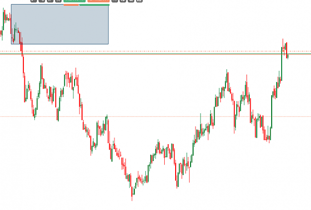
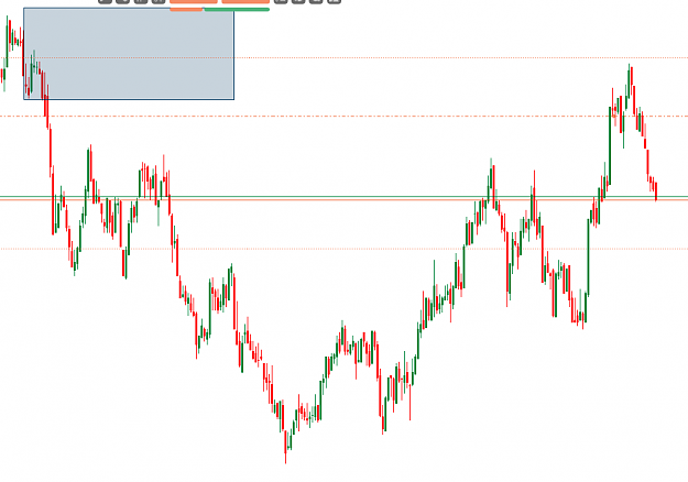
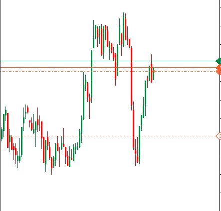
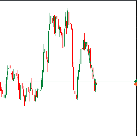
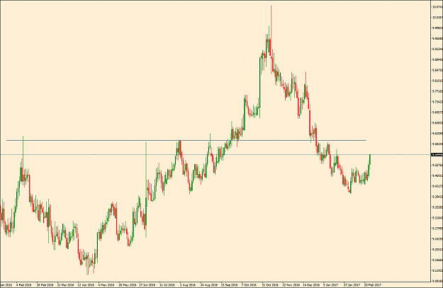
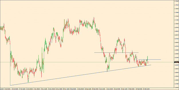
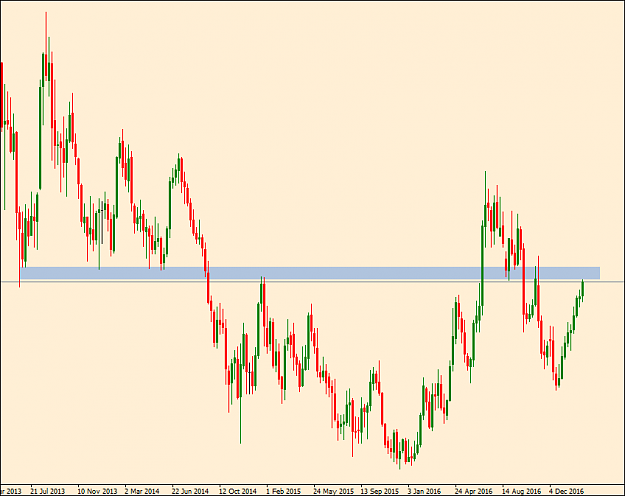
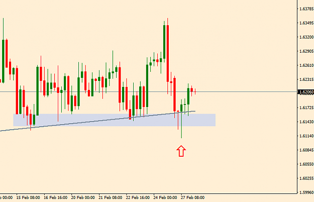
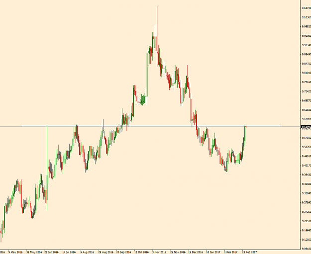
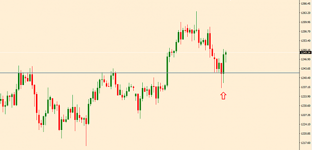
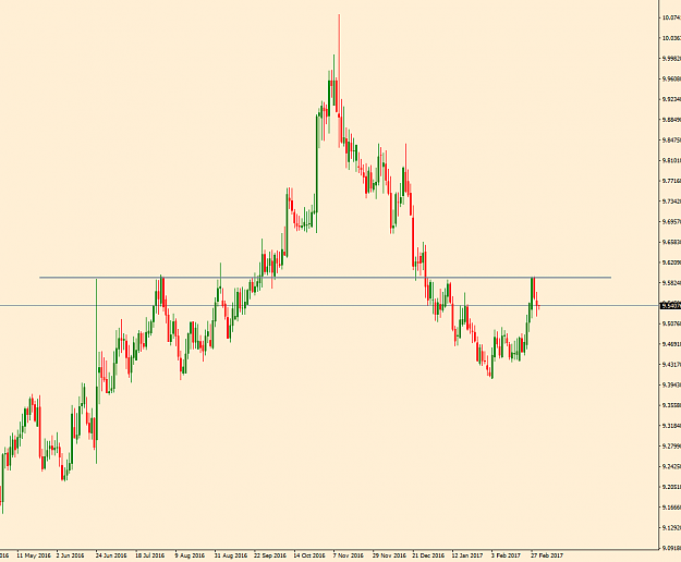
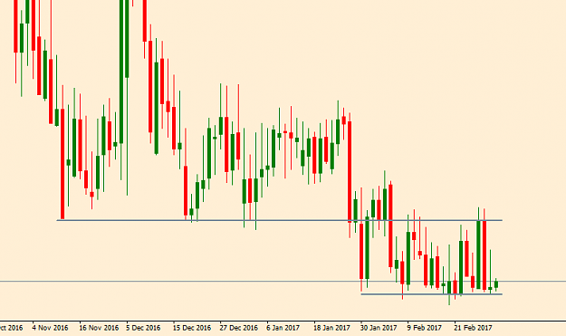
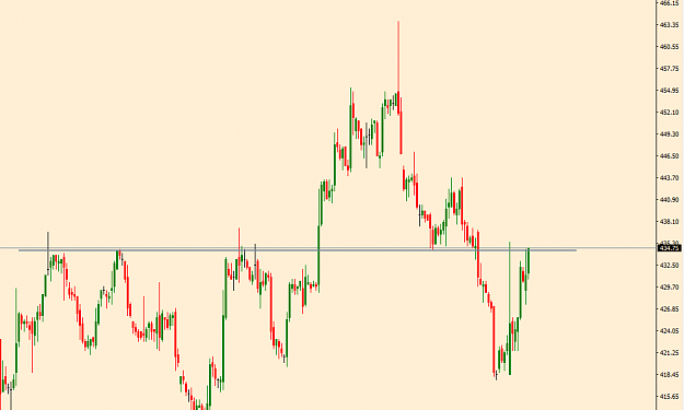
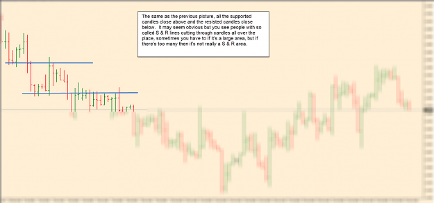
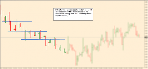
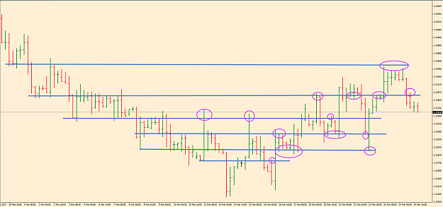
I know I just seem to draw lines on my chart and not much else, but they are important and great places to look for trades. Here's a few follow up pics just to show why, they're not always respected (they have to be broken at some point) but look how price reacted at these. Hope you don't mind the indulgence I'm tending to post more on twitter now as they are directly linked from stocktwits and my website.
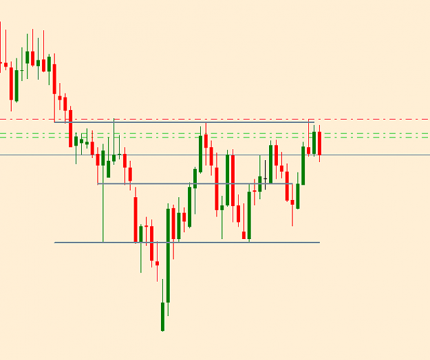
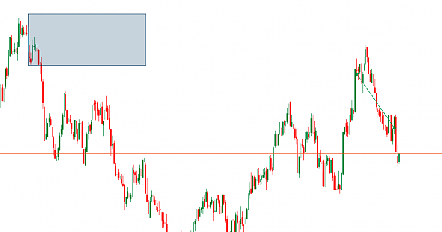
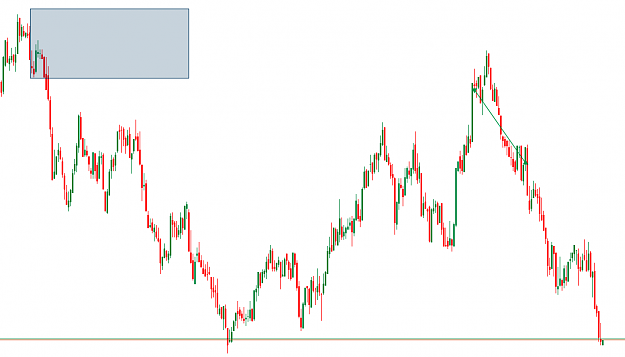
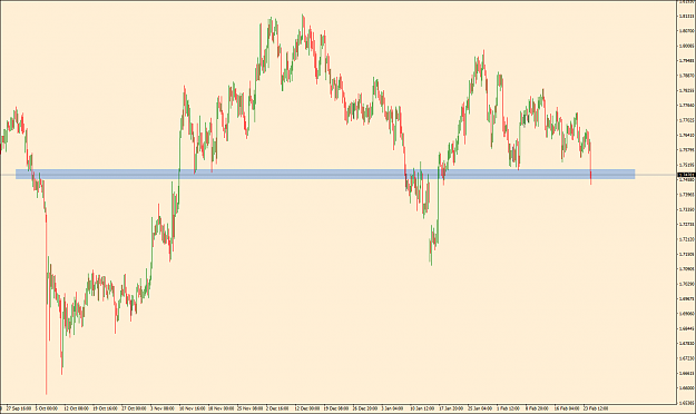
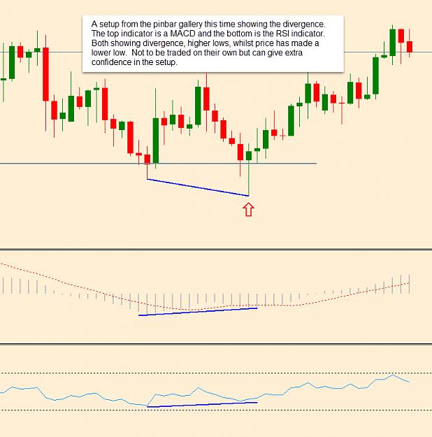
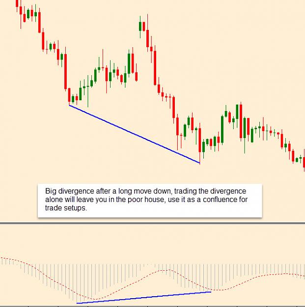
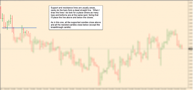
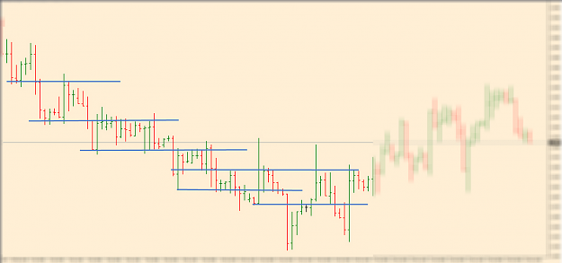
A quick look at how I draw the support and resistance lines, it seems fairly basic but people can struggle to find the levels to draw. I generally don't like lots of lines on my charts, this is for demonstration. I'll add the lines to the left of the chart then show a complete view and the reactions to the lines. I'm not showing trade setups or saying that every area should be traded, but if you've learnt price action bars then just combine them with these areas.
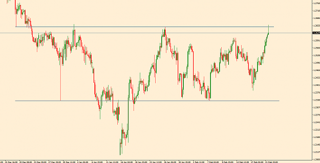
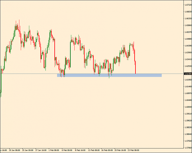
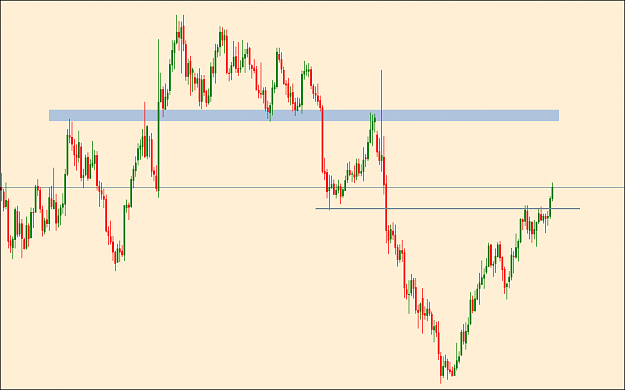
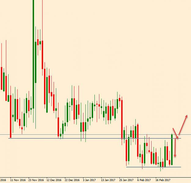
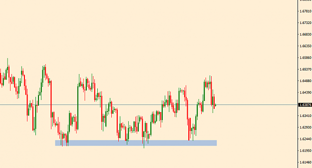
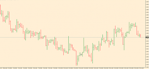
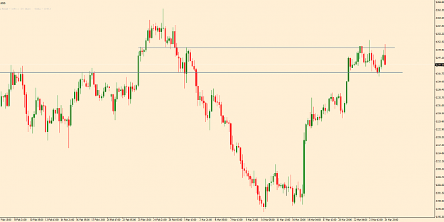
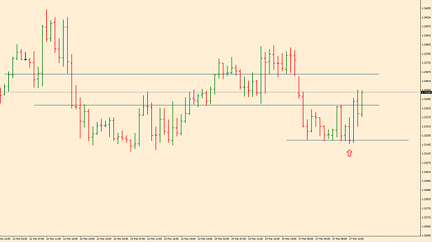
GBPCHF 4 Hour chart as of now. Doesn't look too inviting, several long wicks and large bars, but by breaking it down it becomes a clear tradeable chart.
Enlarge the charts to see clearer.
Attached Image (click to enlarge)
Attached Image (click to enlarge)
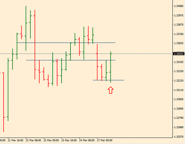
Attached Image (click to enlarge)
Attached Image (click to enlarge)
Attached Image (click to enlarge)
Attached Image (click to enlarge)
Thoughts are welcome, good or bad. I hope it may be helpful.