While most traders love the excitement of trading on margin, that initial rush often turns quickly to fear the first time price accelerates against their position, and they realize they have no control over which way a market moves. Their initial fear is a good thing because it stops them from losing more money. It also generally prompts them to learn more on how markets move. But often even as they move up the learning curve, and become better educated and more experienced, the fear remains. In fact, over time the fear never really dissipates because regardless of how good it felt to be right and make money, it feels a lot worse to be wrong and lose money. Beauty, like making money, is only skin deep, but losing cuts to the bone. Fear can over time becomes habitual, even after acquiring a proper method and trading plan, and that's a handicap. Even with the best trading method you need positive experience, and you need to continue to learn. Fear creates pressure that can smother your ability to see market subtleties and learn from them, making it nearly impossible to acquire positive experience. A key to getting over the fear of trading, and replacing it with a healthy excitement, is to understand how markets move and be able to determine a markets dominant pattern. A straight forward tactic to lend you confidence and help you feel more in control is to gauge a markets pattern by measuring the depth or height of its retracements over time, and then waiting for set-ups and signal in that direction.
There certainly are no guarantees when it comes to defining market movement, but we can tell you that one of the most interesting things a trader can ponder is the philosophy that a market is fractal in nature in that the sum of the parts - think smaller time frame moves --equal the whole - larger time frame moves -- and those parts are scaled replications of the whole, and of each other. To quote Robert Rhea who wrote The Dow Theory over 80 years ago: "One piece of steel does not make a bridge, but every engineer knows that it is a definite part of the entire structure".
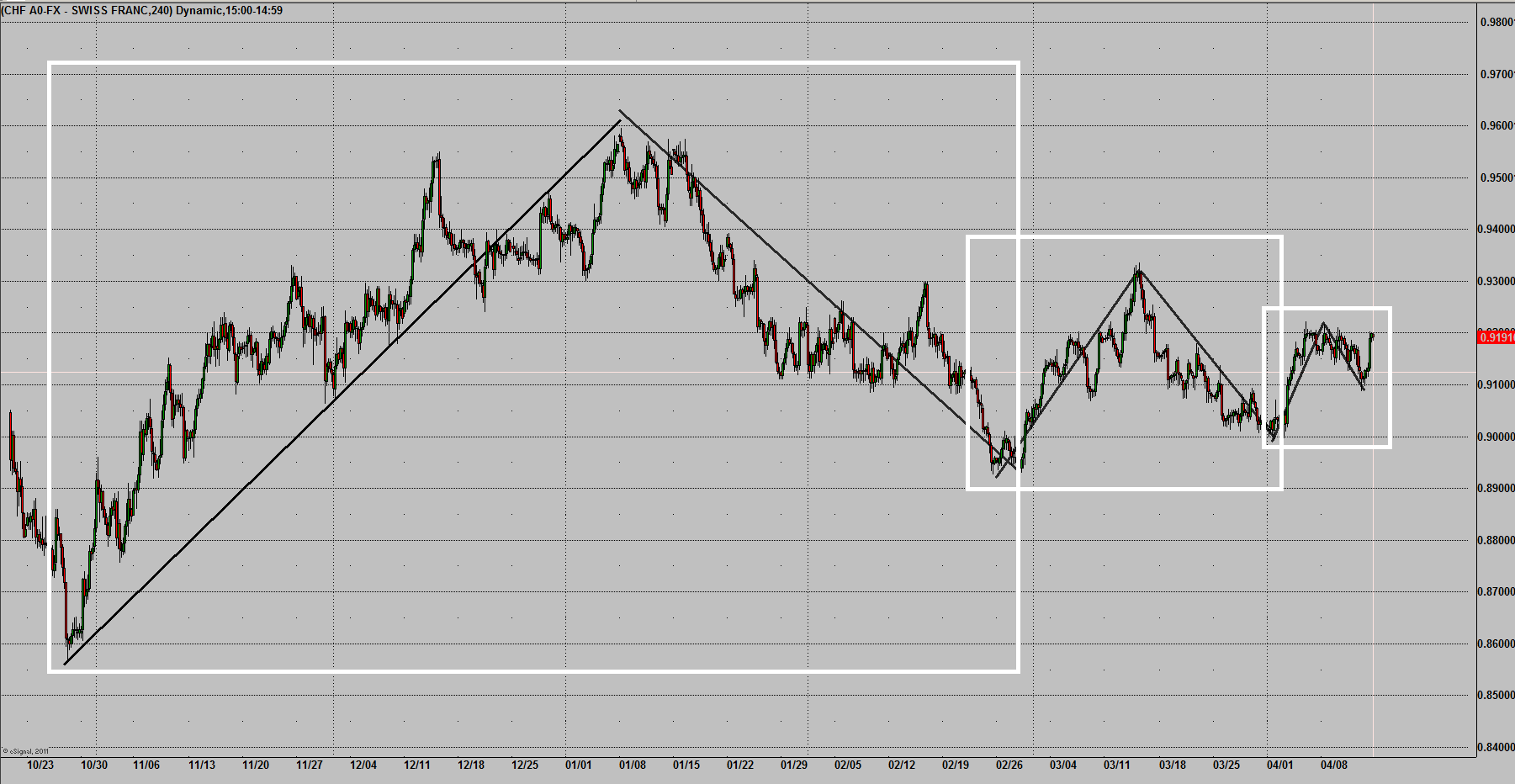
Figure 1 Bullish Scalability in USDCHF
The chart in Figure 1 demonstrates this principle. Each box on this 240-minute USDCHF chart highlights the same pattern - an impulse rally followed by a reactive correction. And despite steep sell-offs, or retracements, the market is showing us a bullish stance on three different scales, or patterns. If this were a video I could scroll down and show two smaller replications of that same pattern before the rally on the right side of the chart. And why is this significant? Because each pattern is in itself bullish, because the degree of the retracement produced another higher low. (For a detailed explanation of different patterns at play in the market see Chapter 10 of Rhea's classic The Dow Theory.) The demonstration in Figure 1 is an important step to understanding how markets move. And the main reasons it works for us is because it works the same as nearly everything else in the world. A market is either growing and showing a positive curve, or contracting and showing a negative growth curve. The patterns created by the impulse and reactive price moves are a reflection of the current fundamentals in that market, and help us determine at a glance whether a market is growing or contracting. But before you proceed to trade an individual market based on it's growth pattern, know that this chart represents only one market -- and a low yielding one at that. The direction of the impulse moves that determine the scales --retracements -- are influenced by the pattern and direction of the more heavily traded asset class markets, which reflect current investment conditions and the global business cycle. The patterns of low yielding currency pairs where the countries are all implementing similar Keynesian policies, or commodities that can be easily substituted, can be compared to planets taking their cue from the larger stars, such as the S&P 500 with its blue-chip dividends and huge global footprint, or the Australian Dollar with its hefty margined yield.
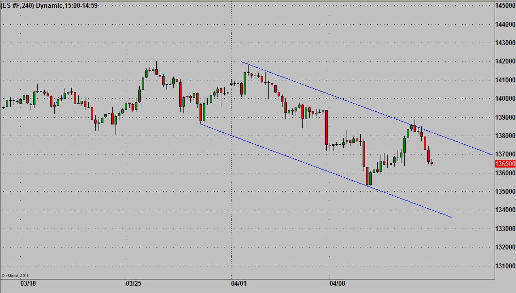
Figure 2 Short-term Bear Pattern in S&P 500
What had us focused on the USDCHF on this day was that this market moves opposite of the big asset class markets. With both the S&P 500 and the Aussie Dollar's short-term patterns bearish - see Figure 2 -- and a slightly disappointing Chinese GDP release the night before, and with USDCHF sitting on no less than 4 bullish patterns/scales, it would have been surprising for us if it did not rally.
Jay Norris is the author of The Secret to Trading: Risk Tolerance Threshold Theory
To see Jay Norris point out trade selections in live markets to Live Market Analysis
Disclaimer: Trading involves risk of loss and is not suitable for all investors.
Disclosure: I have no positions in any stocks mentioned, and no plans to initiate any positions within the next 72 hours.